Why Do It?
Monitors usually come with pre-sets so why bother with this?
- The presets could be for "Office, Internet, Gaming", etc. I have yet to see one for photo work, even in a high end monitor.
- For photo work, the presets are far too bright.
- Color temperature is often wrong, especially in inexpensive units (setting it right takes time).
- Gamma is liable to be off-standard.
- There may be an uneven tonal progression leading to false visual characterization of changes in brightness throught an image.
- If you don't calibrate, there may be no device profile for the monitor or one will have to be assumed. This may lead to errors in rendering images create in color spaces differing from that of the monitor.
By means of calibration all of this can be fixed. The usual objective is to build a device profile for the monitor. You can set this as a default for your system or load it when planning to do photo work. The profile is built from within the monitor's Custom settings where you have best control over brightness, color, etc. As described in "About Monitors", it is highly desirable for your unit to provide a simple way of switching among presets and "Custom" so that you always have the best appearance for the task at hand. A device profile used in Custom mode having brightness optimized for photo work will probably make the monitor look too dim in a bright office or sunlit room. Having built-in presets just a click away overcomes the inconvenience of having to load alternate profiles.
Many approaches are possible. For example, you could prepare calibrated
device profiles for different viewing purposes and load them as needed.
A monitor like the Dell U2410 provides pre-calibrated menu
selections for Internet, Gaming, etc. and this is a great convenience. I select
the Custom mode when calibrating for photo work.
To review, here's what calibration accomplishes:
- Determines the native color space of the monitor and specifies this in standard mathematical format so the Color Management Module can find it in the Profile Connection Space.
- Adjusts Gamma to the standard 2.2 (or something else if you have a specialized requirement)
- Adjusts Color Temperature to the standard 6500K (if you intend shaded daylight viewing of printed images).
- Builds functions for correcting uneven tonal response.
- Possibly other goodies but it's tough to find out just what.
All of this goes into the Device Profile which you can then set as default for your system or as something you load as required. The color space is used by the CMM whereas the other items are used by the monitor drivers to massage temporarily the numbers they send to the monitor to standardize its appearance. Sounds complicated and it is but we don't have to understand it. It just works.
What you end up with is a monitor whose images you can trust. If they don't look right in some way, you will know it's not because of poor monitor adjustments but because of things about the image itself you may be able to correct.
Eyeball or Instrument Calibration?
Eyeball
Calibrating by eye is possible although somewhat imprecise. I am not going into this a lot here because it is not my preference. Imaging software such as Paintshop Pro has a calibration utility and it works surprisingly well, using a series of test patters. Once you go through these, the utility builds a device profile and you are all set.
Drawbacks:
- Mediocre accuracy
- The eye is so adaptive you really cannot set color temperature that way.
- Cannot deal with tonal compensation
Getting started: Initial Setup for Both Eyeball and Instrument Calibration
- Work in subdued lighting and let the monitor warm up for 30 minutes so as to give the LCD backlight time to stabilize. LCDs form images by interposing variable R/G/B filters between your eye and a white light source - the fluorescent backlight. The brightness and color balance of fluorescent sources do not stabilize until the unit's temperature does. Note also that the brightness of a new monitor's backlight declines quickly over a week or two of use, by about 10% in my experience. There may be some color shift too. Be sure to re-calibrate or just wait a few weeks.
- Select "Custom" mode or "Custom Color" from the monitor's built-in menu. I will assume this gives you full control over the R/G/B levels, Brightness and Contrast.
Preparing the Monitor
The objective now is to simplify the monitor control environment. Your setup may differ so just use this as a guide and adapt it to your situation. These measures may not be necessary on all systems but better to be safe than sorry. As an example of an area of uncertainty, I suspect the Spyder software (if you are using the Spyder calibrator) disables any active default monitor profile during a calibration run but they don't come out and say so. On top of it all, your video adaptor software suite has almost certainly provided an "always on" calibrator utility which is dealt with in Steps 2 through 4 below. This utility will likely have controls for controls for brightness, contrast etc. which will operate together with similar controls accessible from the monitor and the active monitor profile (if one is being used - that's not always the case). That is, there are three places where monitor appearance is being controlled (potentially, at least). We need to simplify the situation.
- In Windows XP go to Control Panel/Display/Settings/Advanced/Color Management. In there you will probably see an active default monitor profile and possibly some others. Use "Remove" to remove these (they won't be deleted). The box should be clear of all profiles. I rather doubt this is necessary but there's no harm in excess caution.
- If you have an ATI video adapter, choose the Catalyst Control Center (CCC) tab: If you are using other than ATI video there should be something similar incorporating some controls for gamma, brightness and contrast. Open the CCC and select "Color" options. Click "Defaults" or manually reset Gamma to 1.0, Brightness to 0 and Contrast to 100. Tune out any color bias settings too. We want all settings as neutral as possible. For Catalyst Control Center these are the default positions. For another product it might be something else (except for Gamma which must be 1.0).
- "Apply" and close the CCC. When viewing photos on your monitor, these additional controls for Gamma, brightness and contrast must ALWAYS be at these default settings. Never touch that dial.
- Because you removed the default profile in step 1, the monitor is now influenced only by the default CCC settings. You have minimized system influence over monitor appearance and are ready to calibrate. It probably isn't necessary to clear out the existing profile(s) because the calibration routines in Spyder (or the imaging software, if using its calibration routines) should disable the profile anyway but - who knows for sure?
Contrast and Brightness
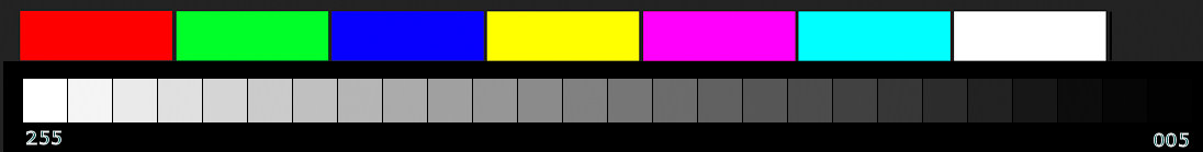
Scroll down a bit and you will see a test pattern similar to many you can find on the Internet. The color patches do not mean a whole lot but the gray scale is useful for eyeball calibration or making adjustments preliminary to instrument calibration. This test pattern is my own creation, incorporating a few things make it superior to most others. For one thing, patches are separated by narrow black borders which minimizes distracting Mach bands. The gray patches are 8 bits per channel and run from a value of [005,005,005] through [255,255,255], the step-per-patch being 10. Ideally, with brightness and contrast correctly set, you should see some difference between the two brightest patches and between the two darkest ones. The dark patch test is the more challenging of the two, especially at the over-all brightness suitable for photo work.
A real weak spot in both calibration methods and not well dealt with anywhere is initial setup of the monitor for brightness and contrast. Somewhat counter-intuitively on LCD monitors, it is the contrast control you need to adjust for best separation of the white patches. Brightness actually determines brightness of the LCD back-panel and it is primarily this which determines separation of the black patches. On top of it all, settings of the R/G/B level or gain controls affects image brightness apart from contribution of the back-panel. This is a rather embarrassing part of calibration. It sounds and is wishy-washy. My method, which works, is this:
- Set the R/G/B levels to approximately 80% so as to leave some headroom for adjustment.
- Brightness is probably way to high. Using the gray scale, adjust Brightness until separation between the two darkest patches just about disappears. On lesser monitors you probably will not find any setting that separates the rightmost two. Try for the 3rd and 4th from the left or even the 4th and the 5th. You do not want that backlight too bright. I have found on less expensive units something like 70% is a good compromise between shadow separation and over-all brightness but on a very bright unit like the premium Dell U2410 you will have to back-off a lot more..
- Adjust Contrast until you can just see a difference between the two brightest patches. On a high performance monitor you may see separation at even the highest contrast setting but this will probably be too bright over-all for photo work turn it down to 90%, at least.
This may put you inside the ballpark. Expect some interaction amongst these settings. This is all very device specific and vague but there seems no other way. I am using a Dell U2410 wide gamut monitor as the standard for advice here. On this unit, which is capable of intense brightness, I ended up with:
- Brigntness = 16%
- Contrast = 50%
- R/G/B = 85/70/78 (after instrument calibration using Spyder)
The overall brightness is 100 cd/sq meter. More on this soon. All patches are separated, including the two darkest. Very nice. The calibration is excellent as is the match between printed images and the monitor presentation.
On a hi-def Viewsonic sRGB monitor, the corresponding settings are:
- Brightness = 70%
- Contrast = 90%
- R/G/B = 80/85/80
With these settings both monitors are difficult to tell apart when side by side and viewing sRGB images. Shadow separation is not as good on the Viewsonic. It separates the 3rd and 4th dark patches which really is not bad at all. The Dell has much higher backlight brightness so this has to be turned down more relative to contrast.
Your settings will vary, possibly a lot. If using an inexpensive monitor, expect Brightness and Contrast settings to be higher and for dark patch separation to disappear below 3rd or 4th or even 5th from the right.
If you are eyeball calibrating I am going to abandon you shortly. You are on your own. Try the calibrator in your imaging software (if it has one) or search the Internet. The one in Paintshop Pro is very good and even provides some Gamma adjustment. When you are finished going through the adjustments it will build a profile you can save and use with the monitor. You might also find useful my Quick and Dirty monitor calibration guide. This includes some suggestions for adjusting brightness if the control isn't present in your chosen calibration mode.
There is, however, one more thing you can do before moving on to manual calibration and that is to optimize over-all brightness. Instrument calibration minded photogs will not adjust over-all brightness until later but may find the remainder of this discussion useful.
Most photo workers recommend a screen brightness of 90 - 120 cd/sq.m. This looks a bit dark in a well-lit room but the reason for it is sound in the context of photography. An image adjusted to look "just right" on such a screen, in subdued lighting, is liable to produce a print that looks "just right" when viewed in typical daylight room lighting. I have certainly found this to be the case with Epson ink jets and 100 cd/sq.m just about perfect. Prints are at the mercy of ambient lighting so a hard and fast rule is impossible but 100 cd/sq.m is a good starting point. Your objective is that when you print and view the result in indirect daylight (or under equivalent lamp), the image brightness approximates the monitor view. Proceed as follows:
- Open up a pure white page. Notepad, Word, or just about any other document app can do this.
- Haul out your digital camera and choose "Manual" operation. Turn off auto-focus and any exposure compensation.
- Use just about any lens except for a wide-angle and set it to infinity although this is not critical. Avoid close-up focus as this impairs exposure accuracy.
- Choose spot metering. If not available, make sure you are close enough to the monitor the white page fills the camera frame.
- Set ISO = 200, shutter = 1/20s and choose F8. You can use other ISOs so long as you compensate the exposure by changing shutter and or F-stop. ISO 200 is good because it enables using low shutter speed setting. Lower speeds are calibrated in smaller steps which makes this process more accurate.
- In very subdued ambient lighting, adjust the monitor Brightness control until correct exposure is indicated. You could also use Contrast but I think it is better to possibly sacrifice some shadow detail rather than compromising contrast in brighter parts of images. You might find some adjustment of both works best. If This method of measurement should put you inside that 90 - 120 range. You can tweak it later to best match your printed results. That is, if prints are too dark, your monitor may be too bright - which causes you to darken the image to make it look right. If prints are too light, your eyeball is probably responding to a monitor that is too dark and you are over-lightening your images.
So what about all the pains taken to get the gray scale just right in the first place? You will probably find the gray scale still looks good with the white patches not quite so intense. There's compromise at work here but having an appropriate brightness is crucial to successful photo preparation. If there were a better way I would like to know what it is. Having to do initial brightness and contrast manually is an awkward part of the process, even when taking the instrumentation approach.
Instrument Calibration
Most of the foregoing material applies to both eyeball and instrument calibration as setup preliminary to the remainder of calibration. I won't have much to say about instrument calibration because the product documentation will tell you how. Just follow the instructions. You might also find some useful advice on setting up brightness and contrast although in the case of the Spyder it really wasn't much help. The "Spyder" system gets good reviews and I am confident recommending it. Thom Hogan suggests practically any product does a good job but I have to talk about what I know. What follows are mostly some general suggestions and a few things specific to Spyder.
Instrument calibration involves a colorimeter which is a piece of hardware comprising sensors and filters able to measure color wavelengths and intensity with good accuracy. Companion software generates test colors, stepping the monitor through a wide range of outputs. These are quantified and as a final step a device profile is built complete with color space and calibration data. The "Elite" system accepts target values for color temperature, Gamma and over-all brightness.
If you are considering "Spyder", get the "Elite" version. The colorimeter is the same for all their packages but the Elite software offers a level of flexibility (including over-all brightness calibration) you may find useful. Yes, it is expensive, but after spending a lot of money on a good camera, lenses, computers and software it makes no sense to me why anyone would start nickel-and-dime-ing when it comes to calibration, especially when it is so important to your objective - fine images on the monitor or in print. A good calibrator is a pleasure to use and takes the tedium and uncertainty out of calibration.
Let's assume you went through the preliminary setup and have reasonable settings for Brightness and Contrast. The RGB sliders have some headroom for adjustment and the monitor is warmed up. If your calibrator cannot guide you to a target brightness, use the camera method of setting overall brightness to that 90 - 120 cd/sq.m range:
Spyder Specific:
- Avoid that silly suction cup. It will leave a greasy spot on the monitor that is difficult to remove.
- Use the Advanced control panel for the Elite package. That's the only place you can set a target brightness (let's say 100 cd/sq.m)
- Be sure not to overlook identifying monitor type to the software. For some reason they do not prompt for this at start-up.
- Be sure to specify that you are using color sliders. This provides for the most precise adjustments.
- Familiarize yourself with all the software (Tools, etc). An annoyance with Spyder is that not all options are presented in an obvious way. You may have to hunt for certain settings. Explore a bit before using the thing for the first time. It's actually very easy to use.
- The system will not let you save a profile over one with the same name, which is a minor nuisance.
General - applies to all calibration systems:
Unless you have a very specialized objective, such as wanting to prepare images for prints to be viewed in peculiar lighting circumstances, go with the standard calibration numbers for color temperature and Gamma.
- Monitor must be in Custom mode (which you will also use for photo work). If there is no Custom mode, choose sRGB or aRGB if you have it.
- Color Temperature = 6500K (some will disagree - it depends on intended viewing environment)
- Gamma = 2.2
- Brightness = 100 cd/sq.m (90 - 120) ... suggested. If your calibrator cannot help you set an appropriate brightness, use the "camera method" described earlier. If you cannot adjust brightness on the monitor (sometimes a restriction with certain presets), the "Quick and Dirty" page tells you how to do it in the video adaptor settings.
- Calibrate in subdued lighting. You don't need total darkness.
Instrument calibration is easy, fun and precise. The software steps you through the process and most of it is automatic anyway. The Spyder takes about 10 minutes to do the job. The ongoing prompts are generally excellent as are the results.
When its all over you have your ideal profile for photo work. Spyder automatically makes this your monitor default. Spyder has a "Profile Chooser" utility so you can switch profiles at any time. You can go into Windows Control Panel/Displays and make any other profile the default at startup. Just remember to load the custom profile and switch to Custom mode (the same monitor mode in which you calibrated) for imaging work.
Caveat:
If your monitor has a preset such as gaming/multimedia/cool/warm/whatever chosen (meaning the Custom mode in which you calibrated is NOT selected) for non-photo work, the current monitor profile (which might be your calibration profile for photo work) remains active. Unless I have missed something, this could be problematic. These monitor presets are built-in profiles in the monitor itself and know nothing about the profile being used by the video drivers. Furthermore, Color Management (the CMM) will be using the currently loaded profile, not the monitor built-in.
If you use the canned presets you might want to think about having some complementary profiles available to load. All you really need would be sRGB and possibly aRGB (if you have a wide gamut monitor). The standard selections in Control Panel are just color spaces anyway which would leave all actual tweaking to what's in the monitor.
I don't bother with this. The photo calibration profile in Custom mode looks great for all my non-photo work too. If I want something brighter, I choose one of the presets willy-nilly. Having it ride on top of the photo profile also looks fine. The sort of viewing supported by the canned presets isn't critical anyway.